
Expert Insight
Expert Insight: Yanwen Hang on Human-Centered Innovation, Healthcare Design, and the Synthesis of Emerging Technology and Visual Art
Curatone Art & Research Journal, Vol. 1, Issue 2 (2026)
Received: June 28, 2026
Accepted: July 2, 2026
Published: July 7, 2026
Keywords: Brand Strategy, Typography, Algorithmic Vitality, Type Directors Club (TDC), Experiential Design, Outside-In Empathy, IBM, HashiCorp, Visual Architecture.
Abstract: This interview explores the dual-track career of Yanwen Hang, a prominent visual strategist bridging elite typographic scholarship with enterprise-scale brand leadership. The text examines her specialized design methodologies, specifically the "Outside-In" Empathy Method and the "Algorithmic Vitality" framework, which synthesize math logic with organic design. Furthermore, it investigates the critical role of typographic excellence in global communication and the strategies behind directing visual continuity during multi-billion dollar corporate mergers.
As part of Curatone.art’s ongoing research initiative, we feature Yanwen Hang — an internationally acclaimed brand designer, visual lead at IBM, and typographic pioneer. This conversation examines how deeply rooted artistic lineages can be cross-pollinated with complex corporate technology to transform automated digital interfaces into profound vessels for cross-cultural communication.
Expert Biography
Yanwen Hang is an internationally celebrated brand designer, visual strategist, and experiential design leader distinguished by her work across elite cultural institutions and high-stakes corporate tech ecosystems. Backed by an exceptional academic pedigree, she holds a Bachelor of Fine Arts from the School of the Art Institute of Chicago (SAIC) and a Master of Fine Arts from the Art Center College of Design. Currently driving brand innovation at IBM, Yanwen previously served as the Visual Lead for HashiCorp, where she masterminded the overarching experiential design for HashiConf (anchoring over 10,000 global tech leaders) and engineered the multi-million dollar AWS re:Invent Diamond-level activation, directly influencing $63.39M in strategic pipeline. Following HashiCorp's multi-billion dollar acquisition, she spearheaded the complex visual integration of the brand into the IBM network.
Coming from a prestigious creative lineage as the great-grandchild of the traditional Chinese landscape painting master Lu Yanshao, Yanwen's independent visual discourse has earned the industry’s highest global accolades. She is a multi-year winner of the prestigious Typographic Excellence Award from the Type Directors Club (TDC 66 & TDC 68), a Grand Winner at the NYX Awards, and a multi-Platinum and Gold recipient at the Muse Creative Awards. Her works, including Cyberdada, No U Turn, and Oh Fructose, have been featured in the TDC International Travel Exhibition, the Changwon National University International Arts Festival in South Korea, and published among the top 100 global practitioners by Creative Quarterly. Additionally, she serves as an Invited International Judging Panel Member for the NYCxDesign Festival’s Design Nexus Awards.
Selected for the Curatone Annual Review 2026 (Academic Print & Digital Edition).
Yanwen, your philosophy of art is based on a great artistic heritage, as you are a great-granddaughter of the legendary Chinese landscape painter Lu Yanshao. You see the task of design not in solving problems commercially but rather as a “vessel” for human perception. How does this tradition of fine arts affect your decision-making processes in creating visual systems of modern tech companies?
My great-grandfather, the legendary landscape painter Lu Yanshao, viewed painting not as a mere replication of the physical world, but as an expression of internal vitality and the flow of energy (Qi). Inheriting this tradition deeply reshaped my understanding of graphic design. I do not see the layout, the canvas, or the visual system as a commercial problem-solving exercise; rather, I see graphic design as a "vessel" for human consciousness and perception. In my decision-making process, this fine arts heritage dictates how I manipulate form, structure, and space. Instead of treating graphic design as a static arrangement of text and images, I treat the canvas as a living ecosystem. I place immense value on the negative space, structural weight, and the rhythmic transition of visual elements. This allows me to elevate graphic design from a functional utility into an evocative visual language, one that balances structural rigor with emotional resonance, inviting the viewer to not just read the design, but to truly feel and inhabit it.
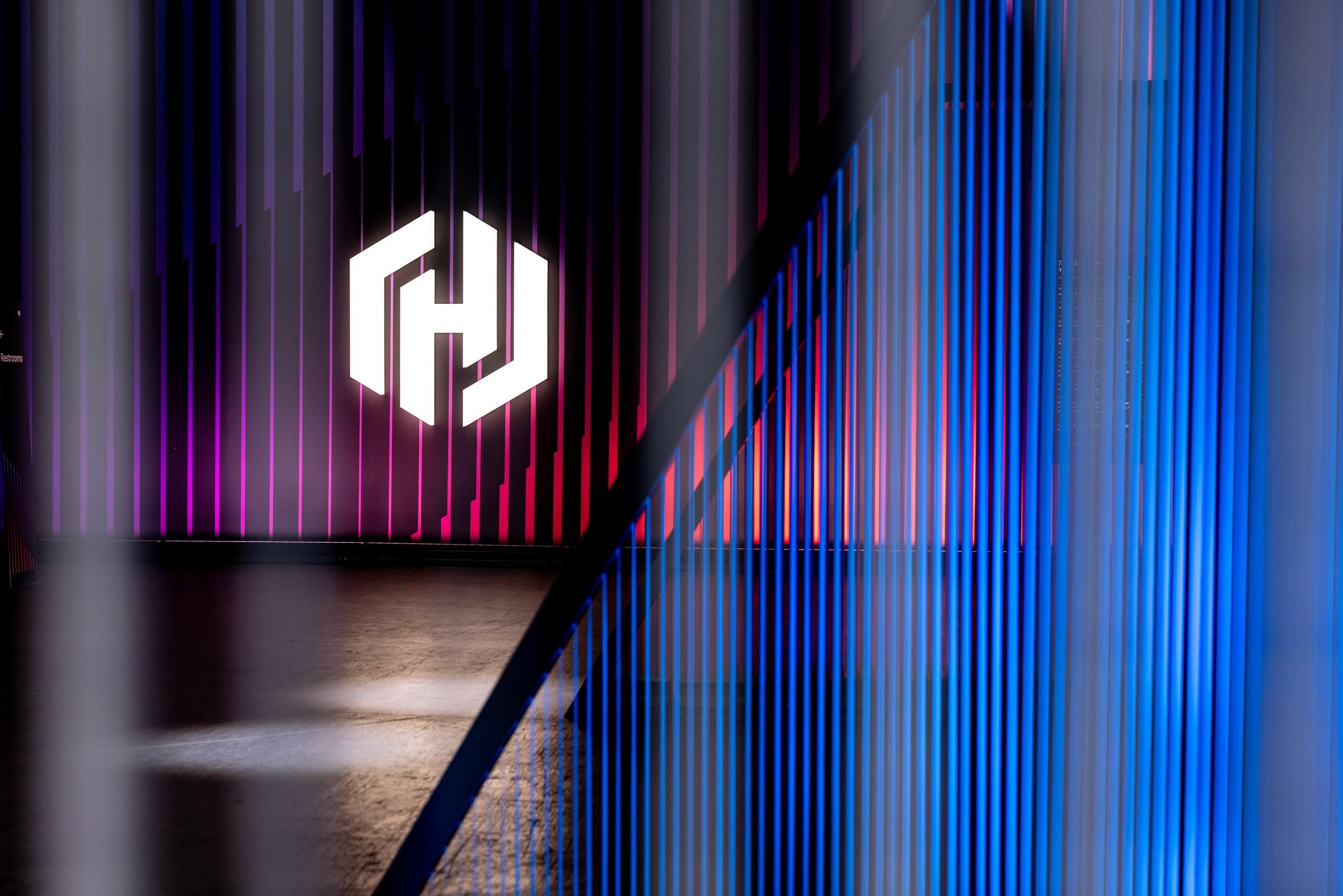
HashiConf '25 Keynote Entrance. An immersive, large-scale spatial entry designed for the HashiConf '25 keynote hall entrance. It uses dynamic ambient architectural lighting and layered vertical louvers to extend corporate color gradients into a physical, living environment that naturally orients and welcomes attendees.
In order to build up connection between automated computer software and human perception, you invented Outside-In Empathy Method, which helps to create visual environment through understanding human psychology. Would you please elaborate on the mechanisms of this method? How do you transform human psychology into graphic layout, color system, and hierarchy of fonts?
The Outside-In Empathy Method is a design framework explicitly built to view physical environments entirely through the eyes and psychology of the attendee, rather than the ego of the designer. When humans enter a massive event activation, they are often hit with a chaotic wall of noise and heavy cognitive overload. The core mechanism of this method is to dismantle that friction, transforming the brand identity into a completely seamless, immersive environment rather than just crudely plastering printed graphics onto flat walls.
• Graphic Layout (Content is King): We eliminate decorative distractions and let the core content dictate the architecture. By using expansive, open grid systems embedded directly into the physical space, information becomes clear and uncluttered, providing attendees with intuitive orientation, structural breathing room, and zero cognitive anxiety.
• Color Systems (Brand Extension through Materiality): We reject flat, harsh printed graphics. Instead, we extend the core brand colors into the environment by embedding them directly into diverse physical materials, lighting, and textures. Grounding, material-based base tones provide psychological safety, while responsive, vibrant light accents naturally spark curiosity from a distance.
• Typography Hierarchy as a Navigational Voice: Fonts are integrated into the environment's human scale. Monumental, architectural typographic structures establish a confident sense of place, while tactile, eye-level text treatments act as a warm, reassuring conversational guide that supports the visitor's journey.
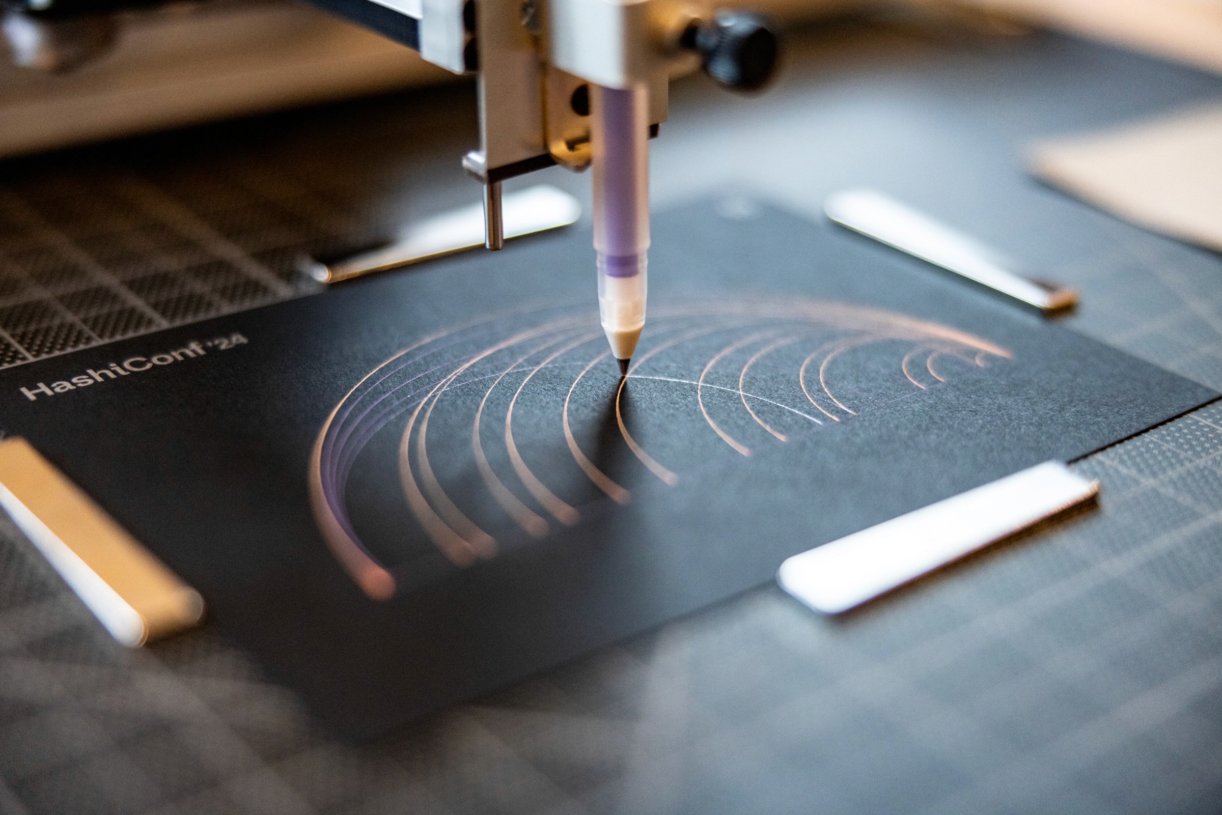
HashiConf '24 Generative Art Plotter. An on-site generative art activation featuring a precision mechanical pen plotter drawing continuous, interactive linework. The custom algorithm maps the interplay between Security Lifecycle Management (SLM) and Infrastructure Lifecycle Management (ILM) using dual-colored ink on premium matte black cardstock.
Twice you were nominated to the Typographic Excellence Award by Type Directors Club (TDC 66 & TDC 68) for No U Turn and Cyberdada and your typography was represented in international traveling exhibitions. Why in your opinion does the typography become such an effective tool of global intercultural communication? How may the intensive exhibition activity improve commercial practice of a designer?
Typography is the ultimate tool for global intercultural communication because it sits precisely at the intersection of logical text and emotional image. When my projects No U Turn and Cyberdada were recognized by the Type Directors Club (TDC 66 & 68), it proved that even if an audience cannot read a specific language, they can instantly read the emotional and cultural energy embedded within the letterforms. Typography translates abstract mindsets into a universal visual language that connects with human perception across borders. In terms of practice, intensive exhibition activity in highly curated, academic spaces acts as a vital creative laboratory. In a gallery space, your visual concepts are stripped of corporate constraints and tested purely on their emotional and structural strength. This academic validation elevates a designer’s authority. It allows me to bring an uncompromised artistic rigor and bold, proprietary frameworks—like my Algorithmic Vitality methodology—back to commercial clients. This immersion transforms you from someone who merely executes a brief into a trusted visual strategist who defines the future direction of a brand.
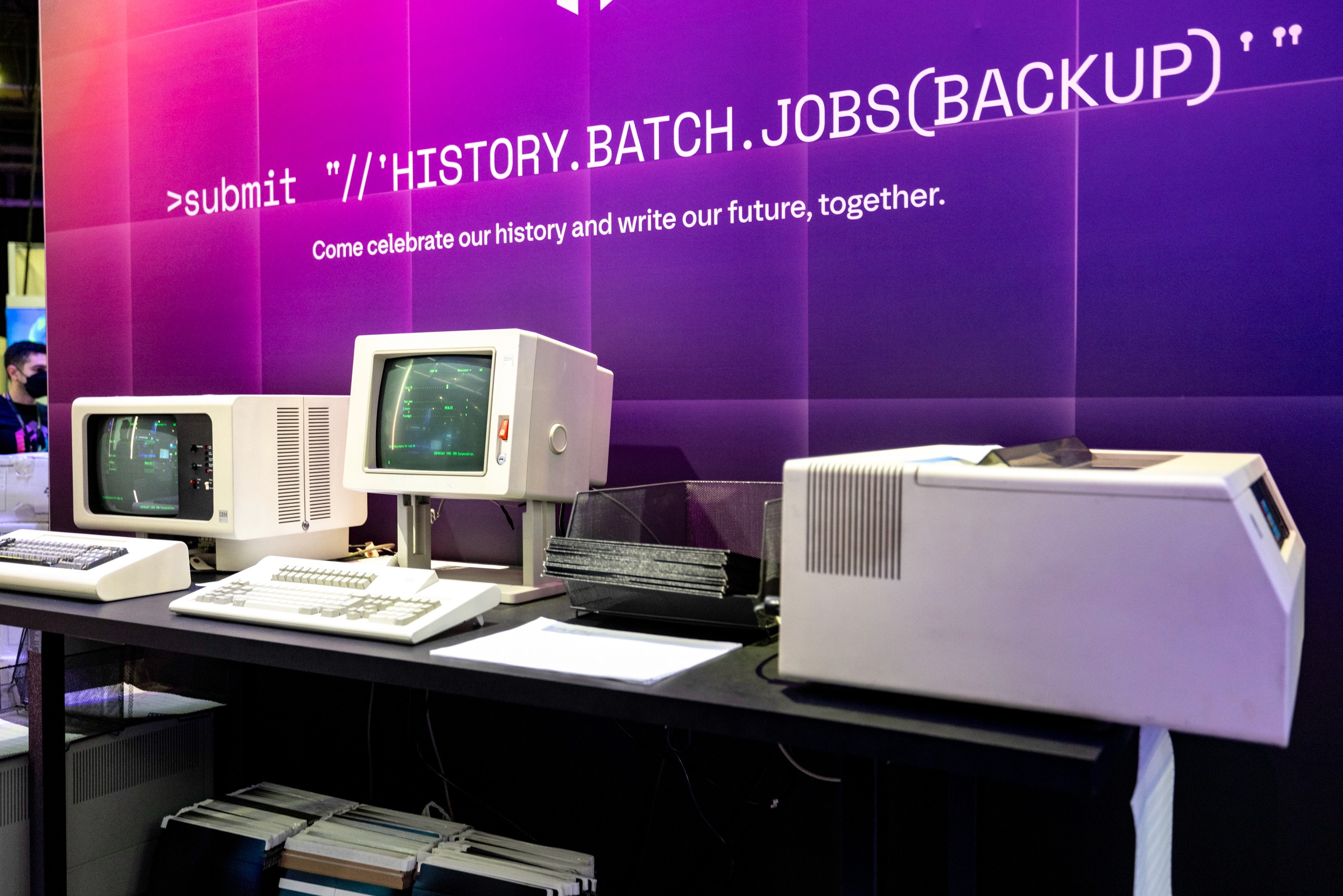
Vintage Printer Setup at AWS re:Invent 2025. A nostalgic tactile activation situated within the modern cloud infrastructure booth at AWS re:Invent 2025. It utilizes functioning vintage computer terminals and a live dot- matrix printer to generate personalized ASCII art, turning abstract back-end coding into a physical, highly memorable keepsake for attendees.
At HashiCorp and IBM, you designed the Experiential Brand Design for Global Flagship and organized the multi-million-dollar AWS re:Invent Diamond-level interactive activation, which exceeded the expected baseline of the project by 105%. What are the basic visual and structural techniques needed for building up an exhibition booth, which would attract human attention and create $63.39 million executive business pipeline?
At premier gatherings like AWS re:Invent, generating a $63.39 million pipeline requires designing a "theater of engagement" tailored entirely around the attendee's sensory and psychological journey. Cloud infrastructure is inherently abstract, so instead of forcing attendees to read flat, generic printed walls, we created a fully immersive spatial environment where deep-tech concepts became tangible, memorable tactile experiences. Every single touchpoint—from the architecture to the activations and swags—was designed to be deeply engaging and unforgettable:
• The Interactive Keyboard Wall: We embedded a massive, responsive interactive keyboard wall directly into the physical structure. This allowed attendees to physically interact with the booth, transforming a cold tech concept into an intuitive, playful, and collaborative spatial experience that naturally lowered their cognitive defense.
• The Vintage ASCII Art Printer: To anchor the digital brand in a nostalgic and artistic way, we set up a live vintage printer that generated custom ASCII art on-site. Instead of handing out standard marketing brochures that get thrown away, we gave attendees a personalized, textured piece of tech-art that they watched come to life, sparking immense curiosity and long lines.
• Thoughtful Swag (Custom Keycaps): Our swag strategy rejected generic promotional items. We designed custom, premium mechanical keyboard caps. Since mechanical keyboards are an extension of a modern professional's daily identity, this tactile gift created a permanent, high-value visual connection to our brand that attendees proudly carried back to their real-world desks. By aligning the entire activation with the psychology of the modern practitioner, we broke through the noise of the trade show floor, elevated the brand's perceived value, and created a premium space that effortlessly converted audience intrigue into massive business growth.
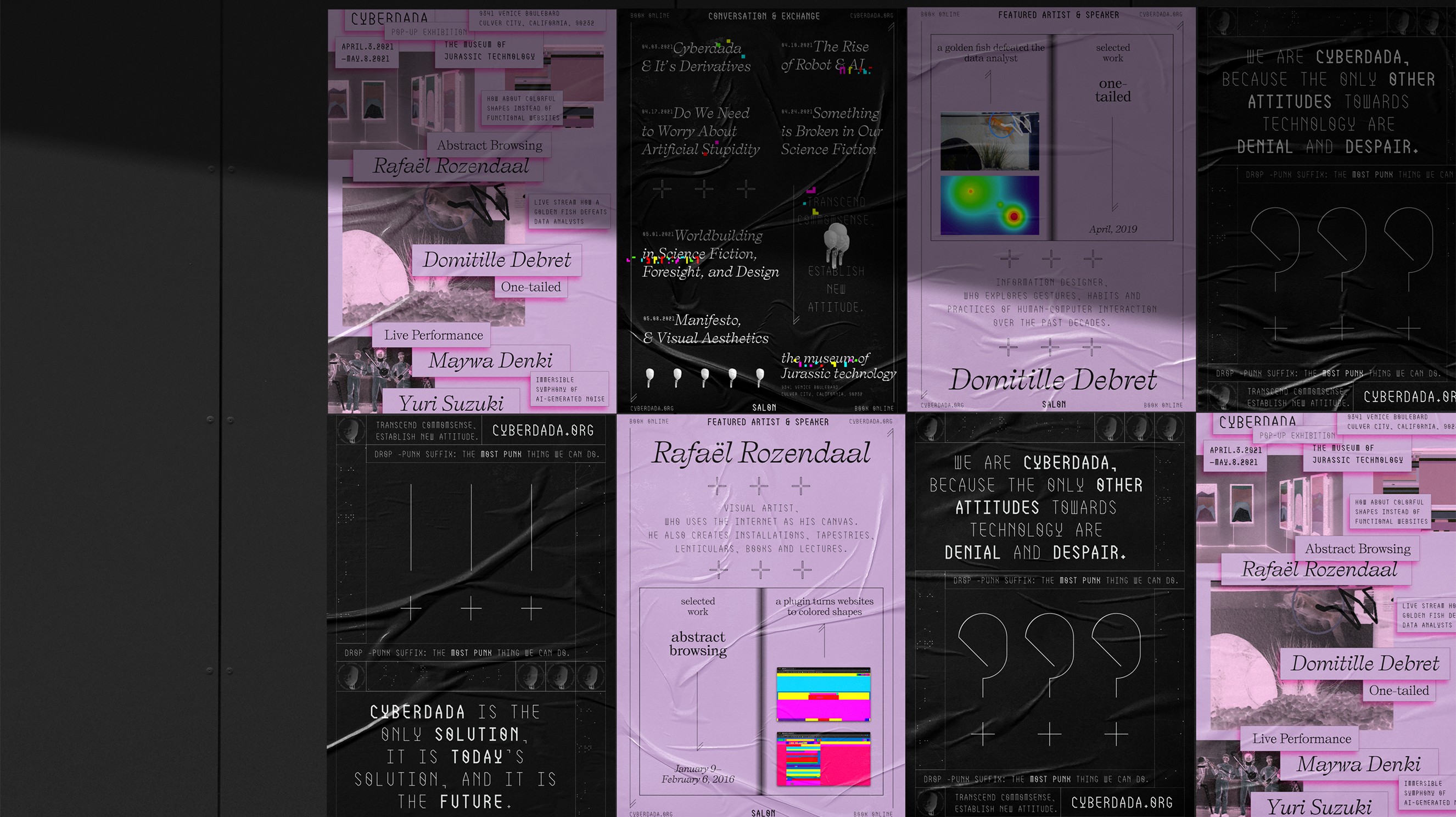
Cyberdada Poster Series. A curated exhibition layout displaying the Cyberdada poster series, exploring human psychology and evolutionary logic within automated systems. The design leverages strict content-driven typography, high-contrast monochrome tones, and textured, organic crumpled paper overlays to evoke sensory immersiveness.
Your art is widely recognized due to participation in major exhibitions and publication, including archiving of No U Turn on Fonts In Use, presentation of your contemporary visual methodology at the Changwon National University International Arts Festival in South Korea, inclusion in the list of global top 100 designers by Creative Quarterly. How does the representation of your work in these highly academic and curated spaces impact your commercial practice? Is it helpful for you to immerse yourself in the space of “pure art” to find out more bold and uncompromised visual systems for such tech leaders as IBM and HashiCorp?
Immersing myself in highly academic and curated spaces—such as having my work archived on Fonts In Use, presenting at international contemporary arts festivals, or being recognized by premium design publications like Creative Quarterly, is essential for pioneering forward-looking commercial strategies. These platforms represent a realm of uncompromised creative exploration where design principles can evolve entirely free from short-term corporate constraints. For major enterprise tech organizations where products can inherently feel cold, invisible, and abstract, this ongoing immersion is incredibly valuable. Corporate branding is highly prone to rapid homogenization, with industries often defaulting to identical formulas and repetitive visual clichés. By channeling advanced conceptual frameworks, such as marrying scientific, objective mathematical rigor with dynamic, organic evolutionary logic, I can introduce bold, defensible visual systems that stand out in a crowded market. Pure art spaces provide the deep theoretical and philosophical foundation needed to design brand environments that are not just superficial, trendy decorations, but inimitable, future-proof assets that build profound user trust and undeniable market differentiation.
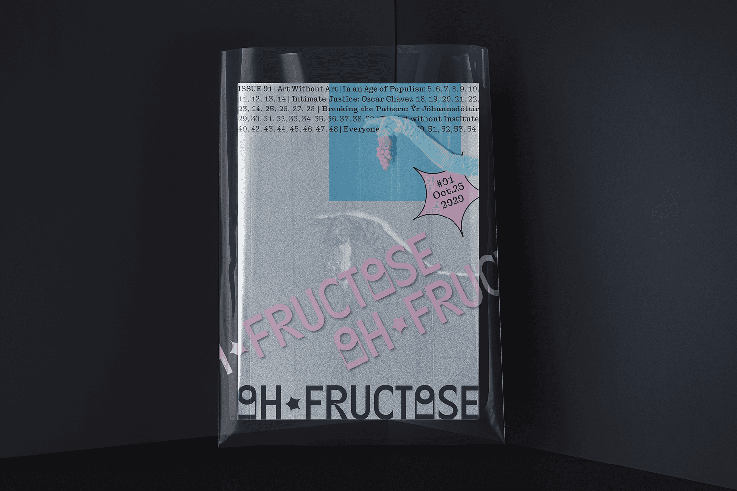
Oh Fructose Cover Design. The conceptual publication cover design for Oh Fructose, emphasizing a strict mathematical layout rule where content entirely dictates form. The physical presentation extends branding through materiality, utilizing a tactile printed zine enclosed within a custom, translucent protective vinyl sleeve.
You had the serious task to preserve brand identity and integrate it into visual system at the time of multi-billion dollar acquisition and merger of HashiCorp. What are the main difficulties faced by the visual strategist who integrates two different brand identities and preserves the brand continuity?
During a multi-billion-dollar merger and acquisition, such as the historic transition of HashiCorp into IBM, a visual strategist faces the monumental task of maintaining emotional and visual continuity. The primary difficulty lies in balancing the preservation of existing brand equity with the alignment of a future corporate ecosystem, all while managing the anxiety of the user community.
• The Challenge of User Trust: In deeply technical open-source communities, users and practitioners possess immense tribal loyalty to the brand's visual identity. Any abrupt or superficial change can instantly shatter user trust and damage brand integrity.
• The Strategy of Synthesis: To navigate this, the visual strategist cannot just force one brand's graphics onto another. My approach is to act as a "stabilizer". I dive deep into the visual DNA of both organizations to find shared structural principles. By building an integrated communication framework where the heritage of the acquired brand is structurally woven into the new parent environment, we assure the community that their ecosystem is evolving rather than being erased. This maintains emotional continuity and safeguards multi-billion-dollar brand equity during high-stakes corporate shifts.
Editorial & Review Credits
Editor-in-Chief & Interviewer: Elizaveta Akimova
Featured Expert: Yanwen Hang
Editorial Review Board:
Xinyue Hope Shen (Award-winning, Cornell-trained landscape architect and design critic with global project experience at SWA Group. Recognized by the National ASLA, IDA, and MUSE Design Awards, and a guest lecturer and critic at UNLV and the University of Houston): "Yanwen Hang’s work demonstrates a rare ability to transform typography, brand strategy, and spatial experience into a unified language of perception. Her practice stands out for bridging fine-art sensitivity with enterprise-scale visual systems, showing how design can preserve cultural depth while creating measurable impact in complex global technology environments."
Yumei Feng (Award-winning product designer, artist, and AI innovator specializing in human-centered design and healthcare tech. Recognized by the Red Dot and UX Design Awards, with work exhibited at NYCxDESIGN and the Louvre, she has served as a competition judge for the UW Protothon): "Demonstrating a compelling exploration of how experiential design transforms technology and typography into immersive systems of perception, bridging global brand strategy with deeply human-centered ways of seeing and feeling space."
Zhijiang Shan (Architectural Researcher specializing in Sustainable Design; member of ASC and IIDA, recipient of the 2025 "World's Best Architect" award): "This paper presents an in-depth design interview of interdisciplinary research value, integrating traditional Chinese landscape aesthetics with the visual identity systems of cutting-edge technology brands. It comprehensively presents two exclusive original design frameworks, featuring a complete theoretical system backed by a substantial number of actionable commercial case studies. The article clearly dissects core industry issues such as typography, immersive spatial design, and post-merger visual integration, offering a fresh Eastern perspective for contemporary experience design and global brand visual communication—possessing both academic depth and practical industry significance."
This article has undergone an editorial review process by members of the Curatone.art Editorial Board.
How to cite: Hang, Y. (2026). Yanwen Hang on Visual Strategy, Typographic Scholarship, and the Synthesis of Math Logic and Organic Design. Curatone Art & Research Journal, 1(2). Retrieved from https://curatone.art/publications/yanwen-hang
Research Context & Expert References
This interview is a foundational part of Curatone.art’s ongoing research project: "The Impact of Contemporary Art and Design on Global Social Structures." Our research explores how artistic practices, brand strategy, and communication design evolve into vital tools for social progress, cross-cultural empathy, and corporate responsibility. By documenting the insights of multi-disciplinary experts like Yanwen Hang, Curatone.art aims to map the critical intersection of elite visual scholarship, typographic innovation, and massive-scale industrial execution in the 21st century.
Selected Bibliography & Academic Sources:
Bringhurst, R. (2004). The Elements Typographic Style. Hartley & Marks.
Type Directors Club. (2022). Typography 68: The Annual of the Type Directors Club. https://tdc.org/
Maeda, J. (2006). The Laws of Simplicity (Simplicity: Design, Technology, Business, Life). MIT Press.
Meggs, P. B., & Purvis, A. W. (2016). Meggs' History of Graphic Design. John Wiley & Sons.
Lupton, E. (2010). Thinking with Type: A Critical Guide for Designers, Writers, Editors, & Students. Princeton Architectural Press.
Source: https://wenhang.me/
Vol. 1, Issue 2 (2026)
DOI: https://doi.org/10.5281/zenodo.21249439

Featured Artists
We provide media exposure on Curatone.art and across social media for selected finalists and winners