Expert Insight
Expert Insight: Lumi Liu on Data Visualization, Medical Communication, and the Art of Making Complexity Clear
Curatone Art & Research Journal, Vol. 1, Issue 2 (2026)
Received: August 4, 2026
Accepted: August 6, 2026
Published: August 13, 2026
Keywords: Data Visualization, Medical Illustration, Branding, Visual Communication, Information Design, Art Direction, Scientific Accuracy, Cross-Cultural Design.
Abstract: This interview documents the professional journey of Lumi Liu, focusing on the intersection of branding, data visualization, and scientific storytelling. The text explores the methodology of translating complex medical and technical information into clear, emotionally resonant visual narratives, analyzes the balance between artistic expression and scientific accuracy in medical illustration, and investigates the evolving role of the designer as a communicator across cultures and disciplines.
As part of Curatone.art's research project, we feature Lumi Liu — a distinguished creative designer, art director, and co-founder of ING Studio. This interview explores how the synergy between rigorous data visualization and compelling visual storytelling defines the role of the contemporary communication designer in the 21st century.
Expert Biography
Lumi Liu is an accomplished creative designer and art director specializing in branding, data visualization, and storytelling. She holds a Master of Science in Packaging Identities and Systems Design from Pratt Institute (New York) and a Bachelor of Arts in Visual Communication Design from Tsinghua University (Beijing). Her award-winning work has been recognized by the A' Design Award (Silver Winner, 2025), the Asia Design Awards, the 3×3 Illustration Awards, and the KTK Design Award. As a Professional Member and Mentor of the Association of Medical Illustrators (AMI), she has also served as a Professional Juror, evaluating medical visualization for scientific accuracy, visual communication, creativity, and technical excellence. Her experience spans art direction in medical communication at EET Health, co-founding ING Studio, and visual design work with Apple China.
Selected for the Curatone Annual Review 2026 (Academic Print & Digital Edition).
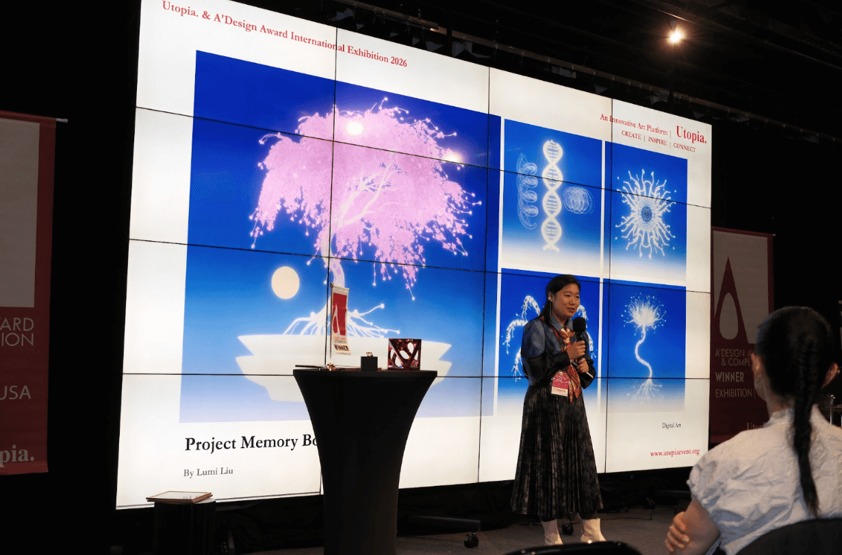
Lumi Liu Presenting the concept and artistic vision behind the Within series at the "Carbon and Silicon" exhibition.
1. Lumi, your practice centers on transforming complex information into clear, compelling visual narratives. Drawing on your Master of Science in Packaging Identities and Systems Design from Pratt and your foundation at Tsinghua University, how do you feel your visual language has evolved? In your opinion, how critical is the ability to translate dense data: particularly in medical and scientific contexts, into imagery that is both accurate and emotionally engaging?
My educational background is deeply rooted in an academic design tradition. From typography and grid systems to color theory, every visual element is supported by a clear design rationale. As a result, when I work on medical and science communication, I see these principles as the building blocks of every project.
When dealing with complex data and scientific information, I always ask myself one question: What is the single most important message this visual should communicate? Once that is clear, I develop the layout, typography, visual hierarchy, and color system around that central idea, ensuring that every design decision serves the same purpose.
This approach allows me to maintain scientific accuracy while also strengthening the visual impact through thoughtful design.
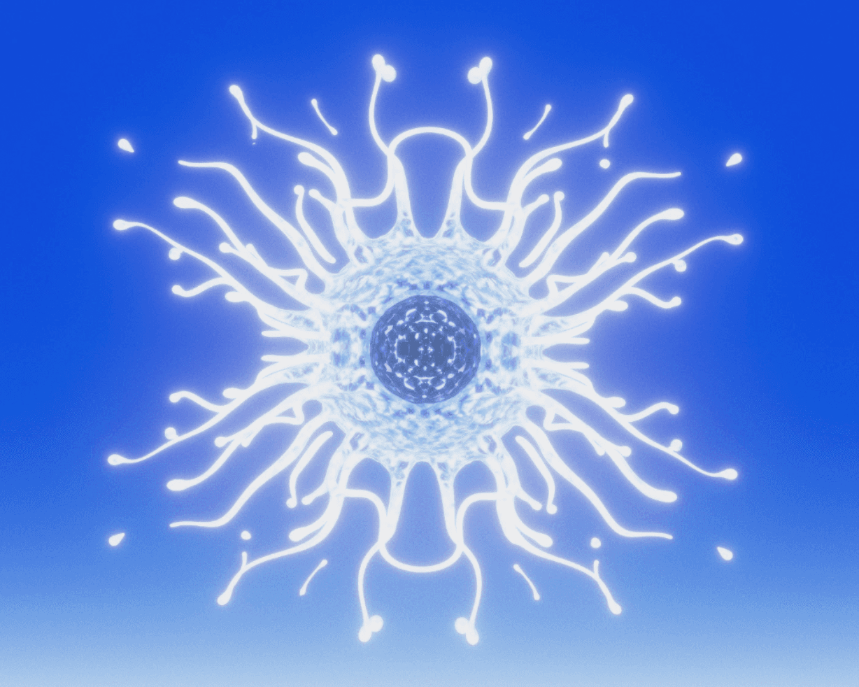
A portrayal of immune cells that defend the body against invading pathogens, while also reflecting how an overactive immune system can lead to inflammation and autoimmune responses.
A defining aspect of your work is the pairing of rigorous scientific accuracy with expressive artistic storytelling. In medical communication, these two worlds are often seen as opposites: the precise and the beautiful. What inspired you to merge them, and how does the discipline of scientific accuracy shape your creative process rather than constrain it?
I don't see scientific accuracy and artistic storytelling as opposites. In fact, I believe they strengthen each other.
Science already contains an extraordinary sense of beauty. When I study cells, neurons, or microscopic structures of the human body, I'm constantly amazed by their intricate details, elegant symmetry, and highly organized forms. That beauty isn't something an artist invents—it's already there in nature.
In my work, scientific accuracy is less about including every piece of information and more about making thoughtful decisions about what to include. The challenge is to avoid overwhelming the audience while preserving the essential scientific message. That requires a deep understanding of the subject before any visual decisions are made.

A visual exploration of DNA as the encoded chain that carries hereditary information across generations.
For me, scientific accuracy is never a limitation—it's a creative framework. It gives me a new perspective on subjects that people think they already know. When viewers are able to see the hidden side of the human body or the microscopic world for the first time, that sense of discovery creates wonder on its own. My role as a designer is to transform that wonder into a visual story that is both scientifically faithful and emotionally engaging.
As Art Director and Brand Designer at Epoch Health, you are responsible for visualizing medical information and for guiding designers and illustrators in organizing and clarifying complex medical data. What is your methodology for turning dense clinical information into visuals that a general audience can immediately understand? And how do you lead a creative team toward a consistent visual standard?
Translating clinical information and laboratory data into visuals that the public can understand is one of the most common challenges in my work.
One technique I rely on is visual metaphor. Scientific data is often presented in a very neutral way: bar charts, pie charts, or statistical graphs… These formats work well for researchers, but they can be difficult for a general audience to connect with.
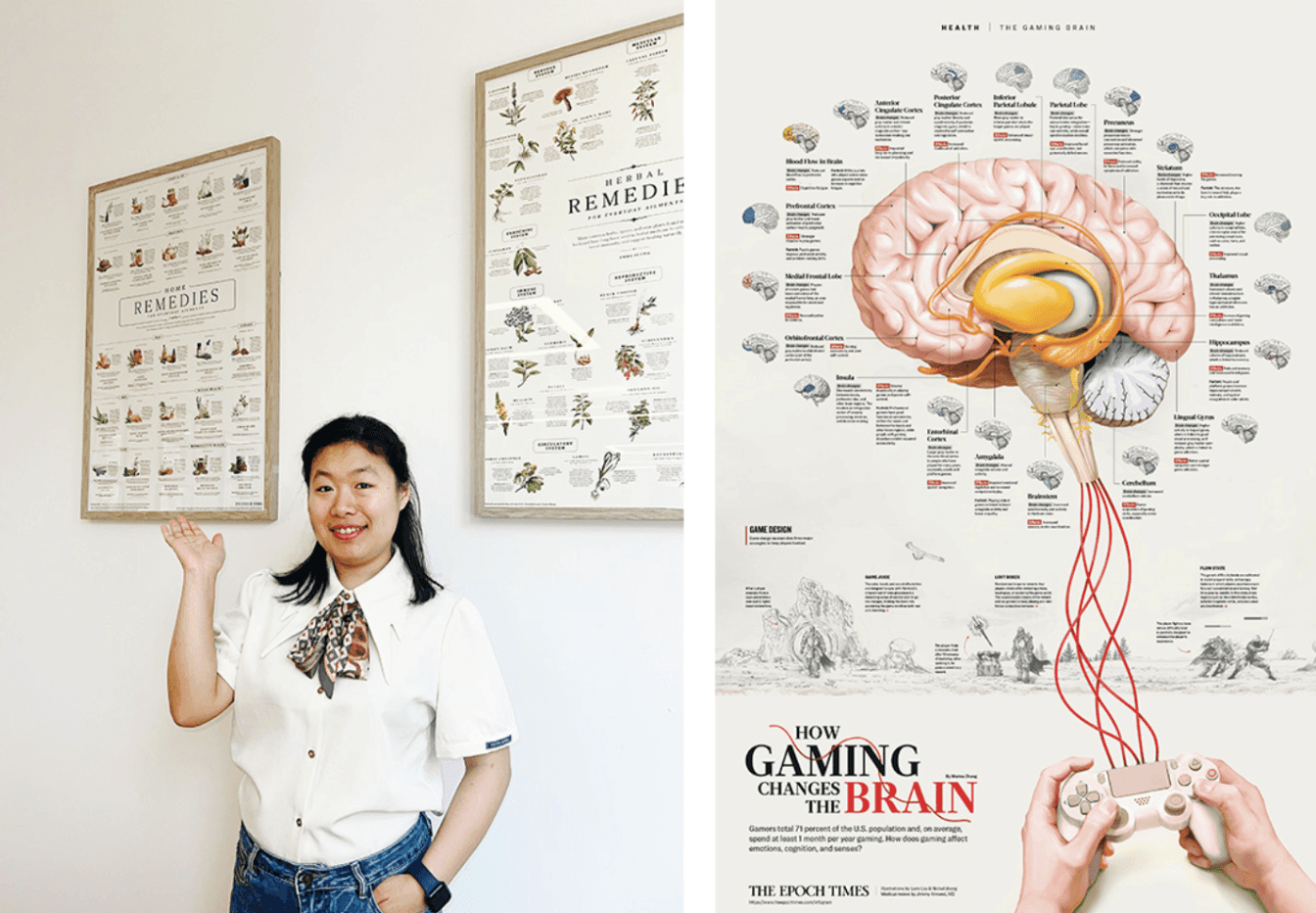
Lumi Liu with printed infographic publications; Infographic “How Game Change The Brain “. An infographic illustrating the brain's physiological and cognitive changes following gameplay.
For example, we recently worked on a story about dandelion root extract inducing cancer cell death. The original research was presented as standard bar charts. Instead of simply recreating those charts, I looked for a visual language that reflected both the data and the story itself. Because the dandelion naturally has a circular form, we transformed the pie chart into a dandelion: if 20% of the cancer cells were eliminated, then 20% of the seeds drifted away in the illustration. The data remained scientifically accurate, but the message became much more intuitive and memorable.
As an art director, I also focus on building a shared visual language within the team. We establish clear systems for typography, color, and layout so that different designers can express their creativity while maintaining a consistent brand identity. We also hold regular design critiques to discuss the thinking behind each project. I believe consistency comes not only from following the same visual style, but from sharing the same design methodology.
As a Professional Member and Mentor of the Association of Medical Illustrators (AMI), you are part of a premier professional network. From your perspective, how does active involvement in such foundational institutions shape a modern designer's standards of practice? How do you balance rigorous professional guidelines with the experimental, creative nature of your work?
I believe that being involved in professional organizations plays an important role in a designer's career, not only by strengthening technical skills but also by building professional standards and ethics.
In medical illustration and science communication, these organizations offer much more than design discussions. Members openly share their experiences with copyright, ethics, client communication, and project workflows. Learning directly from experienced professionals is incredibly valuable, especially early in a designer's career.
I don't see professional standards as a restriction. Instead, they help us understand where the boundaries are and where creativity can thrive.
For example, in medical and scientific visualization, the accuracy of anatomy, cellular structures, and scientific evidence is non-negotiable. That's the foundation of credibility and the reason audiences trust our work. But within that foundation, there is still enormous room for creativity, whether it's choosing a narrative perspective, developing a visual metaphor, or creating an emotional visual experience.
To me, accuracy and creativity are not competing forces. Professional standards give our work credibility, while creativity makes knowledge memorable and accessible. The strongest science communication happens when those two qualities work together.
You were selected as a Professional Juror for the AMI, evaluating works based on scientific accuracy, visual communication, creativity, and technical excellence. From your professional experience, which of these criteria is the most difficult for artists to achieve, and what distinguishes a technically correct visualization from a truly exceptional one?
This is a question I've been thinking about a lot recently, especially after completing this year's medical illustration Salon judging.
In my opinion, the most difficult criterion isn't scientific accuracy—it's creativity. Most professional medical illustrators have strong scientific training, so anatomy, medical knowledge, and technical accuracy are generally not where the biggest differences lie.
What truly distinguishes outstanding work is creative thinking. Many submissions are accurate and well executed, but they present familiar subjects from familiar perspectives. They're technically excellent, yet they don't always surprise the viewer. The strongest work finds a fresh visual language while remaining scientifically faithful.
One piece from this year's judging stood out to me. It visualized neural pathways almost like orbital systems in the universe, using a very bold composition and unconventional layout. The judges had different opinions, some felt the layout was too ambitious and visually dense, while others believed that very boldness made the work memorable. In the end, we agreed that it was an outstanding piece because it introduced a new way of seeing without sacrificing scientific accuracy.
To me, the biggest difference between a technically correct medical illustration and a truly exceptional one is information design rather than illustration alone.
In many works, the text feels as though it was added at the end. In exceptional work, however, the images, typography, and layout are conceived together from the very beginning. They support one another as parts of a single narrative, rather than existing as separate components.
When a piece enables viewers to understand the science effortlessly while also leaving a lasting emotional and visual impression, it has gone beyond technical correctness, it has become truly exceptional.
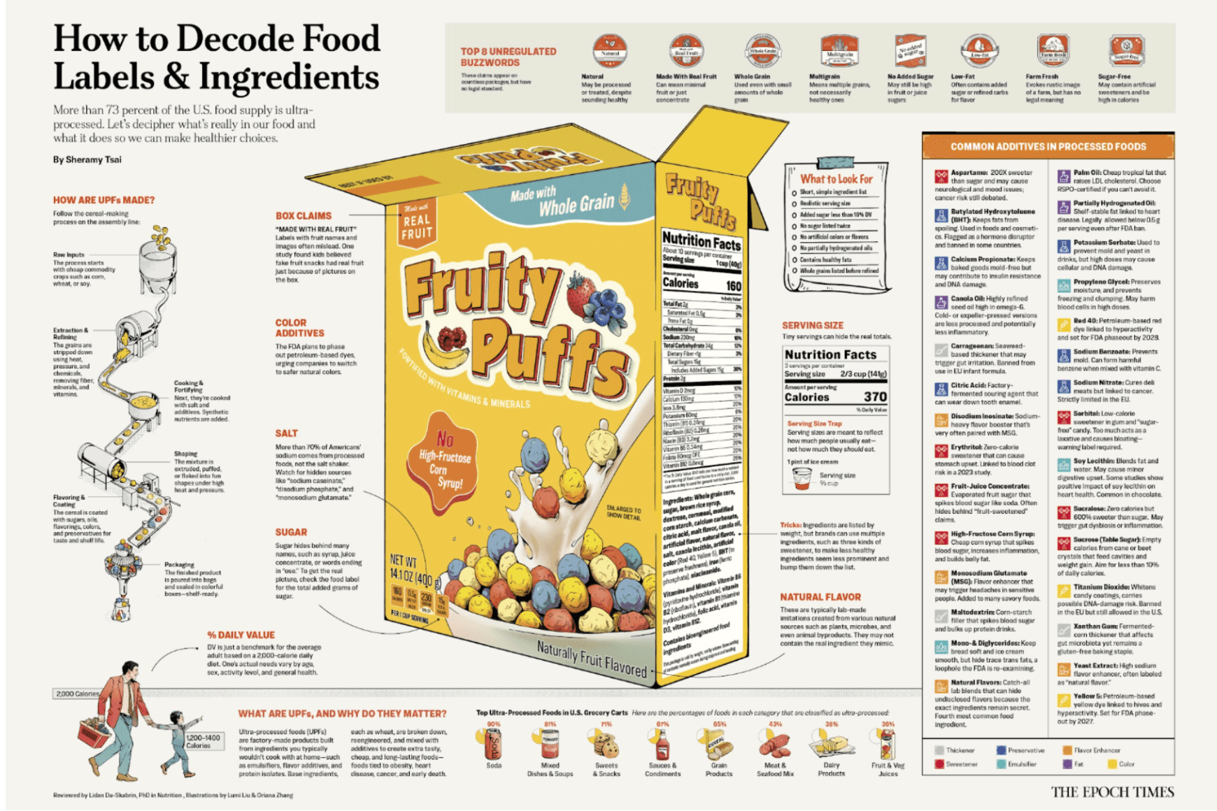
Infographic “Decode Food Label”. An infographic explaining how to interpret nutrition facts and ingredient labels.
Your work has been recognized across a range of prestigious international competitions, including the A' Design Award (Silver, 2025), the Asia Design Awards, the 3×3 Illustration Awards, and the KTK Design Award. Looking back, how have these honors shaped your creative path and professional confidence? In your view, what role do international awards and juried exhibitions play in validating and advancing a designer's career today?
The biggest impact of these awards and exhibitions isn't the recognition itself, it's the opportunity to understand my work more objectively.
Designers often work independently, so it's easy to stay within our own creative habits. International awards and juried exhibitions provide a valuable opportunity to compare our work with peers, receive professional feedback, and better understand where we stand within the field. That perspective helps me identify where I can continue to grow.
To me, international awards are more than recognition. They help build professional credibility, encourage meaningful dialogue within the design community, and open new opportunities for long-term career development.
Your recent work Memory Bonsai was selected for the "Carbon and Silicon" exhibition, co-hosted by the A' Design Award and Utopia., transforming neural structures into a glowing cherry blossom bonsai — a meditation on memory, consciousness, and what remains uniquely human in the age of AI. Your series Within similarly visualizes the microscopic systems of the human body as art. What draws you to the hidden beauty of neurons, cells, and microscopic structures, and how do you translate scientific microscopy into work that carries emotional and philosophical meaning?
Working in medical and science communication has allowed me to see a side of the human body that is normally invisible, and it has completely changed the way I think about life.
I'm fascinated by cells, neurons, and the immune system—not only because of their intricate structures, but because they quietly shape our health, emotions, and even our sense of self. That often makes me wonder: where does our consciousness really come from? Is a human being, in some way, a collection of countless tiny lives working together?
That's why I portray these microscopic structures almost as individual portraits. I want people to encounter them as living characters first—to appreciate their beauty, become curious, and then discover the science behind them.
For me, art isn't about explaining science. It's about revealing a hidden world that has always existed, but that most of us have never had the chance to see.
Editorial & Review Credits
Editor-in-Chief & Interviewer: Elizaveta Akimova
Featured Expert: Lumi Liu
Editorial Review Board:
Natalia Yuresko-Bilous (MFA-qualified artist and educator with 25 years of international experience, a member of the NAAA and Hollis Arts Association, and a founder of art schools in Ukraine and the USA): "Lumi Liu seems to look into places the human eye cannot reach. Her work reminds us that within each of us exists an entire universe — complex, alive, and remarkably beautiful."
Kateryna Malikova (An acclaimed textile designer, author, founder of Malikova Atelier, and International Jury Member for Golden Time Talent. Known for US-exhibited macramé collections and recognized for advancing fiber art, she authored the comprehensive educational reference Macramé: From Ancient Origins to Modern Art): "Lumi Liu’s work demonstrates how technical precision and artistic expression can strengthen one another. As an artist working in technical macramé, I especially appreciate how she transforms complex scientific structures into clear, emotionally engaging visual narratives while preserving the integrity of the original information."
This article has undergone an editorial review process by members of the Curatone.art Editorial Board.
How to cite: Liu, L. (2026). Lumi Liu on Data Visualization, Medical Communication, and the Art of Making Complexity Clear. Curatone Art & Research Journal, 1(2). Retrieved from https://curatone.art/publications/lumi-liu-visualizing-data-complexity
Research Context & Expert References
This interview is a foundational part of Curatone.art's ongoing research project: "The Impact of Contemporary Art and Design on Global Social Structures." Our research explores how artistic and design practices evolve into tools for communication, education, and social change. By documenting the insights of experts like Lumi Liu, Curatone.art aims to map the intersection of creative excellence and professional responsibility in the 21st century.
Selected Bibliography & Academic Sources:
Eisner, E. W. (2002). The Arts and the Creation of Mind. Yale University Press.
Tufte, E. R. (2001). The Visual Display of Quantitative Information (2nd ed.). Graphics Press.
Cairo, A. (2016). The Truthful Art: Data, Charts, and Maps for Communication. New Riders.
Association of Medical Illustrators. https://www.ami.org/
A' Design Award & Competition. https://competition.adesignaward.com/
Vol. 1, Issue 2 (2026)
DOI: https://doi.org/10.5281/zenodo.21907947

Featured Artists
We provide media exposure on Curatone.art and across social media for selected finalists and winners